Elements
Line: linear marks made with a pen or brush. OR the edge created when two shapes meet.
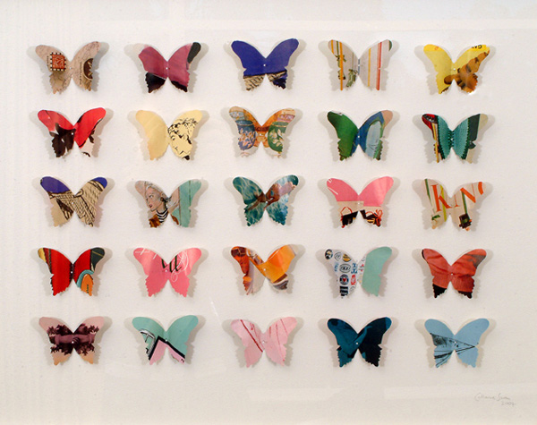
Shape:a self-contained defined area of geometric or organic form. A positive shape in a painting automatically creates a negative shape.
Direction: All lines have direction (horizontal, vertical, or oblique). Horizontal suggests calmness, vertical gives balance and formality, and oblique suggests movement and action.
Size: the relationship of the area occupied by one shape to that of another.
Texture: surface quality of a shape (rough, smooth, glossy, and so on), it can be visual or tactile.
Color (Hue): combinations of color can be used to create focus, balance, harmony, and mood
Value (Tone): the lightness or darkness of a color.
Principles
Balance: similar to balance in physics, large shapes in the center are balanced by smaller ones near the edge, and dark is balanced with light.
Gradation: of size and direction creates linear perspective, of warm to cool and dark to light creates an areal perspective. It can add interest and movement to a shape.
Repetition: to create interest, any repeating element should have a degree of variation.
Contrast: the juxtaposition of opposing elements, major contrast often creates a focal point.
Harmony: the visually satisfying effect of combining similar and related elements.
Dominance: creates emphasis or an area of focus by having one area stand out.
Unity: relating the elements of design to the idea being expressed.