Monday, November 1, 2010

Elements and Principles of Design

Elements
Line: linear marks made with a pen or brush. OR the edge created when two shapes meet.

Shape:a self-contained defined area of geometric or organic form. A positive shape in a painting automatically creates a negative shape.

Direction: All lines have direction (horizontal, vertical, or oblique). Horizontal suggests calmness, vertical gives balance and formality, and oblique suggests movement and action.

Size: the relationship of the area occupied by one shape to that of another.

Texture: surface quality of a shape (rough, smooth, glossy, and so on), it can be visual or tactile.

Color (Hue): combinations of color can be used to create focus, balance, harmony, and mood

Value (Tone): the lightness or darkness of a color.


Principles

Balance: similar to balance in physics, large shapes in the center are balanced by smaller ones near the edge, and dark is balanced with light.

Gradation: of size and direction creates linear perspective, of warm to cool and dark to light creates an areal perspective. It can add interest and movement to a shape.

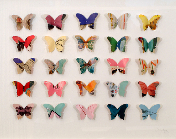
Repetition: to create interest, any repeating element should have a degree of variation. 

Contrast: the juxtaposition of opposing elements, major contrast often creates a focal point.

Harmony: the visually satisfying effect of combining similar and related elements.

Dominance: creates emphasis or an area of focus by having one area stand out.

Unity: relating the elements of design to the idea being expressed.

Monday, October 25, 2010

Illustrator

 The artist I chose was Marion Bolognesi. I chose her illustrations because we have a similar fixation, eyes. Her paintings focus on the emotional intensity a person can show throw just their eyes. Another aspect of her work that I love is the dripping of paint. All of her works have this, which I equate to some sort of sorrow or suffering like the face is crying or melting. In all of her works the eyes just pull you in.


The artwork I created was a more solidified version of her work. A lot of her pieces have a lot of white space in which  there would typically have been a lighter or middle tone. With my piece I made it a bit more  opaque and I used a lot more skin tones than she usually does.  I love her use of cool colors and layering so I tried to incorporate that as well.

Thursday, October 14, 2010

Song Lyrics-Sia-Bring Night


Bring Night! Bring the night on! Bring a little bit of dance bring a little bit of song! Yea!
Bring NIght! Bring the night on! I'm not sure i can wait and this day has felt so long. Yea.
Bring Night! Bring the night on! The music cuts into me and i know it can't be wrong. Yea
Bring Night! Bring the night on! Cuz all that we are after is alittle bit of fun. Yea

Chase your shadow til the sun goes down. Chase your shadow til the sun goes down.

Ooohh oooohh whoooa ohhhh whoooa ohhhh ahhh

Bring Night! Bring the night on! Bring me the moon and stars and send away the sun.Yea

Bring Night! Bring the night on! Or maybe if i'm lucky i'll end up in your arms.

Chase your shadow til the sun goes down! Chase your shadow til the sun goes down!


Ooohh oooohh whoooa ohhhh whoooa ohhhh ahhh


Chase your shadow til the sun goes down! Chase your shadow til the sun goes down!


Chase your shadow til the sun goes down! Chase your shadow til the sun goes down!


Ooohh oooohh whoooa ohhhh whoooa ohhhh ahhh

Bring Night! Bring the night on!

Not an assignment just experiments

I did NOT make this image or character (thus i left the ign.com logo on there). All I did was play around with effects to see what all illustrator does. =D
Original Image


EDITS


Which is your favorite?